Code corresponding to these notes about custom functions in Python can be found in the Plotting.ipynb Jupyter notebook in this repository.
Matplotlib is a Python module that's commonly used for plotting. There are different ways to interact with matplotlib, but we'll be relying on the pyplot submodule. To import this module, it's helpful to give it a shorter "nickname"
import matplotlib.pyplot as plt
When a module (or submodule) is imported with the as keyword, it gives us a different (hopefully shorter) name with which to reference it.
Another module that's commonly used when analyzing and plotting data is numpy
import numpy as np
To generate some coordinates for plotting, we'll start by using a numpy function that creates a series of numbers on a regular interval
x = np.linspace(1,100,100)
Now, we'll create y values by first setting them equal to the x values (using a deep copy)
y = copy.copy(x)
and then adding some random noise
for i in range(len(y)):
    y[i] = y[i] + np.random.normal(0,5,1)
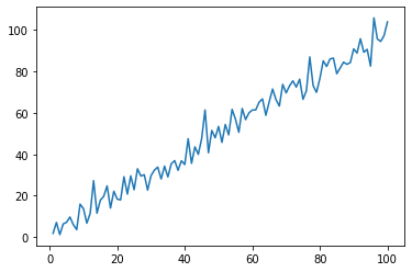
To create a simple line plot, we can use the .plot() function of pyplot
plt.plot(x,y)
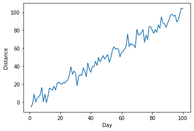
Now, let's say we want to label our axes (which, as good scientists we should always do!). We can call the .xlabel() and .ylabel() functions from pyplot before we call .plot().
plt.ylabel("Distance")
plt.xlabel("Day")
plt.plot(x,y)
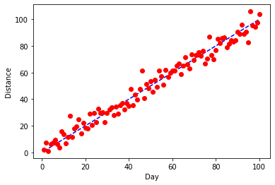
Ok, this is looking better, but now we'd like to know how the observed trend compares to a line with slope 1 and intercept 0. We can add a second line to our plot with the x values on both axes.
plt.ylabel("Distance")
plt.xlabel("Day")
plt.plot(x,y)
plt.plot(x,x)
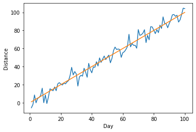
Note how matplotlib automagically changes the color of our 2nd line to be different than the first.
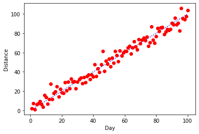
I actually really like these defaults, but let's say that we have a good reason that we want to make some changes. First, we want our 1:1 line underneath and we want it to be a blue, dashed line. For our data, we want to try red dots. pyplot let's us pass a third argument to .plot() that will adjust the color and style of plotting. The first letter (b or r here) will set the color and the next symbols (o or -- here) change the plotting style.
plt.ylabel("Distance")
plt.xlabel("Day")
plt.plot(x,x,'b--')
plt.plot(x,y,'ro')
Here's a variant that uses a dotted 1:1 line.
plt.ylabel("Distance")
plt.xlabel("Day")
plt.plot(x,x,'b:')
plt.plot(x,y,'ro')
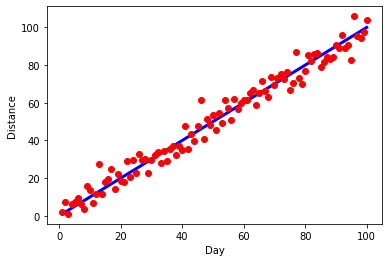
Ok, I actually prefer the solid 1:1 line, so let's go back to that, but let's make the line thicker.
plt.ylabel("Distance")
plt.xlabel("Day")
plt.plot(x,x,'b',linewidth=3)
plt.plot(x,y,'ro')
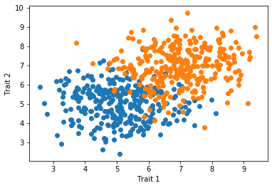
In many cases, we have multiple groups that we want to depict in a single scatter plot. In this case, we can use two .plot() calls back-to-back and matplotlib will color the two groups separately.
x_1 = np.random.normal(5,1,300)
y_1 = np.random.normal(5,1,300)

x_2 = np.random.normal(7,1,300)
y_2 = np.random.normal(7,1,300)

plt.plot(x_1,y_1,'o')
plt.plot(x_2,y_2,'o')
plt.xlabel("Trait 1")
plt.ylabel("Trait 2")
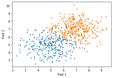
Because the two groups overlap some and the points are relatively large, it can be difficult to see some points. In this case, we may want to reduce the sizes of the points using the markersize argument. We can also make the symbols different between the groups to make them more distinctive.
x_1 = np.random.normal(5,1,300)
y_1 = np.random.normal(5,1,300)

x_2 = np.random.normal(7,1,300)
y_2 = np.random.normal(7,1,300)

plt.plot(x_1,y_1,'^',markersize=3)
plt.plot(x_2,y_2,'o',markersize=3)
plt.xlabel("Trait 1")
plt.ylabel("Trait 2")
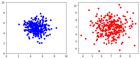
It is often convenient to show two or more plots together. Thankfully pyplot gives us an easy way to group plots.
# The plt.figure() function creates the overall plotting region
# The optional figsize argument allows us to adjust the plotting region's size

plt.figure(figsize=(10,4))

# The plt.subplot() function specifies where the first plot should go
# The first number indicates the number of rows
# The second number indicates the number of columns
# The third number indicates the position of the plot

plt.subplot(121)
plt.plot(x_1,y_1,'bo')

# We use the same dimensions (1 row, 2 columns) for the second plot, but
# use position 2

plt.subplot(122)
plt.plot(x_2,y_2,'ro')

# After we've added the plots, we show the overall figure

plt.show()
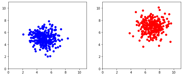
By default, pyplot will match the minimum and maximum extent of each axis to the data being plotted. But in some cases, we'd like to have control over the axes to make plots equivalent.
plt.figure(figsize=(10,4))

plt.subplot(121)
plt.axis([0,11,0,11])  # Adding axis limits [xMin,xMax,yMin,yMax]
plt.plot(x_1,y_1,'bo')

plt.subplot(122)
plt.axis([0,11,0,11])
plt.plot(x_2,y_2,'ro')

plt.show()
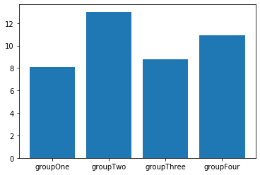
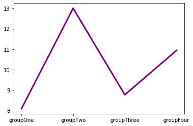
We don't always have two numerical coordinates for each data point. Sometimes, we have data that are naturally categorized in different groups and we're measuring one numeric value per group.
groups = ["groupOne","groupTwo","groupThree","groupFour"]     # Define names of groups
values = np.random.normal(10,2,4) # Drawing four numbers to act as values for groups
plt.bar(groups,values)
The .plot() function can still be used to plot values from categorical variables as a line plot. In this context, line plots make less sense, unless the groups have a natural ordering.
plt.plot(groups,values,"purple",linewidth=3) # Using full word to specify color
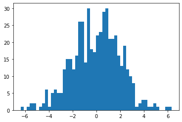
Histograms are useful for visualizing the frequencies of different numeric values in a group. Let's start with a simple example using random values drawn from a Normal distribution.
exampleNums = np.random.normal(0,2,500) # Example data

plt.hist(exampleNums,50)
plt.show()
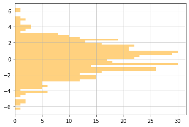
We can also customize the appearance of histograms. Here, we've added gridlines, changed the color, changed the transparency (also known as alpha), and oriented the plot horizontally. We've also written the different arguments to the .hist() function on different lines, so that we can comment each of them individually.
plt.hist(exampleNums,               # Example data (the only required argument)
         50,                        # Number of bins
         color="orange",            # Color of the bars
         alpha=0.5,                 # Transparency of the bars (1=solid,0=totally transparent)
         orientation="horizontal")  # Orienting horizontally
plt.grid(True)
plt.show()
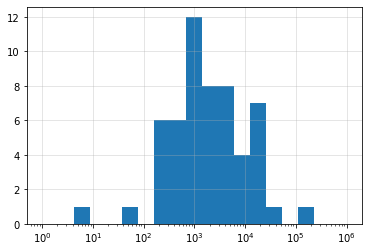
Here is an example with real data showing confirmed cases of COVID-19 across all US states and territories for 4/7/2020.
stateCounts = [2197,211,2575,997,17540,5429,7781,928,1211,14739,9156,274,408,1210,13549,5507,1048,905,1289,16284,519,4371,15202,18852,1069,1915,3037,319,490,2101,747,44416,794,140081,3220,237,8,4782,1472,1181,14582,573,1229,2417,320,4010,8974,1752,575,45,3333,8682,412,2578,221]
plt.hist(stateCounts,30)
plt.show()
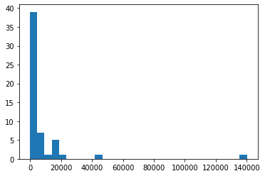
You can clearly see how skewed the distribution of case counts is across the US, with nearly 140,000 cases in New York and more than 40,000 in New Jersey. Because the counts are so skewed, it may be helpful to change from using a linear scale of counts to a log scale. To do this, we need to do two things. We need to tell pyplot to change the x-axis to a log scale, which we do with plt.scale("log"). We also need to generate bins that are equally spaced on a log scale. Thankfully, numpy has a built-in function that can help us - .logspace() - which we use to pass the boundaries of our bins to .hist().
plt.hist(stateCounts,
         bins=np.logspace(0,6,20))  # Using numpy to generate 20 values evenly spaced on a log
                                    # scale from 10^0 to 10^6. These values will define the
                                    # boundaries of our histogram bins.

plt.xscale("log")              # Creating a log x-scale for our histogram

plt.grid(True,alpha=0.4)       # Adding grid and adjusting transparency

plt.show()                     # Displaying the histogram