-
Notifications
You must be signed in to change notification settings - Fork 435
New issue
Have a question about this project? Sign up for a free GitHub account to open an issue and contact its maintainers and the community.
By clicking “Sign up for GitHub”, you agree to our terms of service and privacy statement. We’ll occasionally send you account related emails.
Already on GitHub? Sign in to your account
[Blog] In-depth: Posthog vs Fathom #9836
Conversation
This is unrelated to the current post I'm writing, but I just noticed it in
production and didn't want to forget to fix. Not sure how I fucked this up.
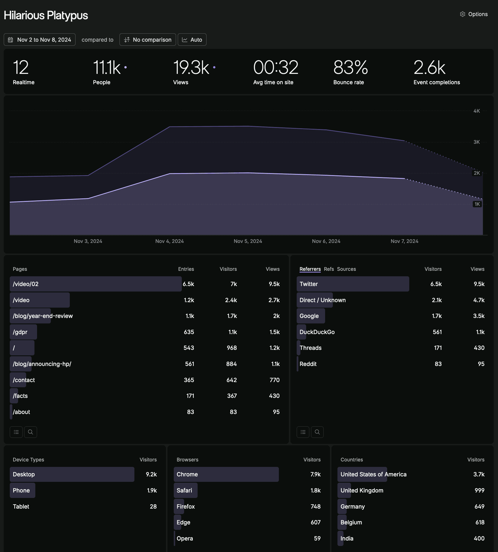
I felt like the screenshots are probably one of the easiest ways to see
the similarities between the two products, so it felt like a good idea to
move this up towards the top of the page.
|
The latest updates on your projects. Learn more about Vercel for Git ↗︎
|
There was a problem hiding this comment.
Choose a reason for hiding this comment
The reason will be displayed to describe this comment to others. Learn more.
Looks good, a few changes, would love to see the preview to see how a couple bits look before giving the 👍
Co-authored-by: Ian Vanagas <[email protected]>
There was a problem hiding this comment.
Choose a reason for hiding this comment
The reason will be displayed to describe this comment to others. Learn more.
Looks good :)
contents/blog/posthog-vs-fathom.mdx
Outdated
| <ProductScreenshot | ||
| imageLight="https://res.cloudinary.com/dmukukwp6/image/upload/web_analytics_dashboard_light_bc76a94566.png" | ||
| imageDark="https://res.cloudinary.com/dmukukwp6/image/upload/web_analytics_dashboard_dark_42ac39a5f7.png" | ||
| classes="rounded" | ||
| alt="PostHog web analytics dashboard" | ||
| /> | ||
|
|
||
|  |
There was a problem hiding this comment.
Choose a reason for hiding this comment
The reason will be displayed to describe this comment to others. Learn more.
This is a lot of screenshots to have all at once, maybe move them below the table with some context on why you are including them? For example:
"In terms of design, both PostHog and Fathom's web analytics dashboards look similar..."
(PostHog screenshot)
"The big difference is that PostHog includes sessions where Fathom only includes visitors"
(Fathom screenshot)
There was a problem hiding this comment.
Choose a reason for hiding this comment
The reason will be displayed to describe this comment to others. Learn more.
we desperately need a carousel option for screenshots!
Co-authored-by: Ian Vanagas <[email protected]>
Co-authored-by: Ian Vanagas <[email protected]>
Co-authored-by: Ian Vanagas <[email protected]>
Changes
This is an in-depth breakdown between PostHog and Fathom Analtyics. It follows a similar structure to the ones we have for Sentry and Plausible.
https://posthog-git-posthog-vs-fathom-post-hog.vercel.app/blog/posthog-vs-fathom
Checklist
vercel.jsonArticle checklist
posthog vs fathomto existingfathom alternativesandfathom competitorskeywordsUseful resources