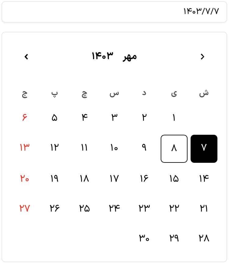
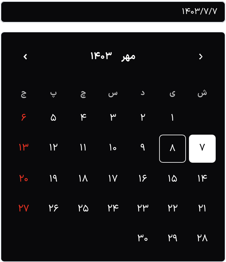
A modern, Persian date picker for React applications. This date picker supports both light and dark themes, providing a sleek and user-friendly interface for selecting dates.
Demo page: Kara Persian Datepicker
To install the package via npm, run:
npm install kara-persian-datepickeryarn add kara-persian-datepickerimport React, {useState} from 'react';
import {DatePicker} from 'kara-persian-datepicker';
import 'kara-persian-datepicker/dist/index.css';
const App: React.FC = () => {
const [selectedDate, setSelectedDate] = useState < string | null > (null);
return (
<div>
<h1>Kara Persian DatePicker</h1>
<DatePicker
value={selectedDate}
textPlaceholder: 'Pick a date'
, // Placeholder text in Persian
onChange={(date) => {
console.log(date);
setSelectedDate(date);
}}
classStyle={{
radius: 8, // Border radius for rounded corners
borderColor: '#E2e8f0', // Border color for the date picker
selectedDayColor: '#007BFF', // Blue color for the selected day
inputStyle: {padding: '10px', fontSize: '16px'}, // Custom input styles
}}
/>
{selectedDate && <p>Selected Date: {selectedDate}</p>}
</div>
);
};
export default App;
- Light and Dark Themes: Easily switch between light and dark modes.
- Modern Design: Flat design with rounded corners for a sleek look.
- User-Friendly: Simple interface for selecting dates.
- Responsive: Works well on various screen sizes.
| Prop | Type | Description |
|---|---|---|
value |
string |
string Or null |
disabled |
boolean |
Optional. If true, disables the date picker. |
theme |
string |
Optional. Allows you to set the theme ('light' or 'dark'). Default is 'light'. |
classStyle |
object |
Optional |
onChange |
(date: Date) => void |
Callback function called when a date is selected. Receives the selected date as an argument. |
| Prop | Value | Description |
|---|---|---|
backgroundColor |
#000 |
Dark background color. |
textColor |
#fff |
White text color. |
textPlaceholder |
'Pick a date' |
Placeholder text (in Persian). |
textAlign |
right |
Aligns text to the right. |
size |
md |
Medium size of the date picker. |
radius |
8px |
Border radius for rounded corners. |
borderColor |
#E2e8f0 |
Border color for the date picker. |
selectedDayColor |
#007BFF |
Blue color for the selected day. |
inputStyle.padding |
10px |
Padding for the input field. |
inputStyle.fontSize |
16px |
Font size for the input text. |
You can customize the appearance of the date picker by modifying the CSS file or overriding styles in your own
stylesheets. The classStyle prop allows for extensive customization, including background color, text color, and size.